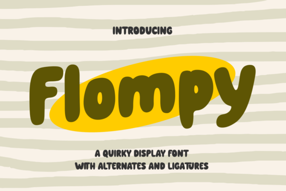
Flompy: A Playful Display Font That Pops on the Web
There I was—midway through building a new landing page for a ceramicist’s online studio—staring at a bland hero section. The client loved “warm, joyful, handmade” energy, but the current sans serif headline felt like a polite whisper instead of a friendly hello. So I dropped in Flompy. Instantly, the space brightened. Not because it’s loud or chaotic, but because its soft, rounded shapes and generous letterforms carry genuine personality—like a smile you can read before you even process the words.
What Flompy Brings to Digital Design
Flompy is a display font built for impact—not endurance. Its charm lives in its gentle curves, slightly uneven baseline rhythm, and that unmistakable friendliness. It’s not trying to be neutral. It’s designed to invite, delight, and differentiate. As a web designer, I appreciate how its bold presence holds up across devices without sacrificing warmth. On desktop, it commands attention in hero headers and section titles. On mobile, it remains legible at 32px and above—especially with proper letter-spacing and contrast.
Where Flompy Shines (and Where It Steps Back)
In practice, Flompy excels where visual tone matters most: hero headlines, CTA buttons (“Get Started”, “Join the Workshop”), section dividers (“Meet the Maker”, “New Glazes Just Dropped”), and testimonial highlights. I used it for a “Handmade with Love” badge on a product card—and yes, customers noticed. It added emotional texture without competing with the imagery.
But here’s what I learned testing it across real layouts: Flompy isn’t meant for body copy, navigation labels, form fields, or small interface text. Its decorative alternates and subtle swashes (which are delightful in SVG exports or static hero images) don’t always render crisply in all browsers at small sizes. And while it’s highly readable at headline scale, it loses clarity below ~24px on mobile—especially over busy image backgrounds or low-contrast surfaces.
Real Layout Tests That Changed My Approach
I tested Flompy across four common scenarios:
- Hero section over a textured photo background: Used light tracking (+40) and white text with subtle drop shadow—clean, warm, instantly scannable.
- Landing page CTA button: Paired with a tight, neutral sans serif (Inter, Regular weight) for the supporting line. Flompy gave the button character; Inter kept it trustworthy and accessible.
- Blog post header on a dark mode layout: Worked beautifully at 48px with #f8f9fa on charcoal—no glow needed, just intentional spacing.
- Mobile navigation toggle label (“Menu”): Too playful. Switched to a clean sans serif. Flompy belongs in the spotlight—not the scaffolding.
It also performed well in email headers (when embedded as web-safe fallbacks were defined) and social banner previews—but only when sized generously and isolated from dense content.
Smart Pairing for Balanced Brand Voice
Flompy thrives when paired intentionally. Think of it as the expressive voice of your brand—and everything else as the supportive listener. For digital projects, I consistently pair it with:
- A modern, highly legible sans serif (like Inter, Manrope, or Public Sans) for body copy, navigation, and UI elements—this keeps hierarchy clear and accessibility strong.
- A quiet serif (such as Literata or Cormorant Garamond) for editorial-style blog headers or “About” sections—adds sophistication without clashing.
- A restrained script (only for very short accents, like “hand-poured” beneath a product name)—used sparingly, never as primary display.
What doesn’t work? Two decorative fonts competing for attention. Or stacking Flompy with another high-contrast display typeface. Simplicity around Flompy is what makes it sing.
Practical Considerations Before You Deploy
Before adding Flompy to a live site or client project, I always check:
- Webfont availability: Does the license include WOFF2? Is there a variable font option? (Flompy comes in standard OTF/TTF, so self-hosting via @font-face is straightforward—but confirm EOT or legacy support isn’t needed.)
- Weight & style options: Flompy is primarily a single-weight display face—perfect for headlines, but not for creating typographic contrast within a heading hierarchy. Plan accordingly.
- Commercial licensing: Yes, it’s cleared for commercial web use—including client sites, SaaS dashboards (as display elements), and e-commerce banners—as long as it’s not redistributed as part of a template library without permission.
- Language support: Covers Latin-based languages well (including accented characters for French, Spanish, German), but verify if your audience needs extended Cyrillic or Vietnamese glyphs.
- Alternates & OpenType features: The stylistic alternates add lovely nuance—great for SVG animations or static hero graphics—but they’re not auto-enabled in CSS. Use font-feature-settings selectively, and test rendering across Safari, Chrome, and Firefox.
One final note: Flompy loads quickly (under 40KB compressed), and its design scales cleanly—even in high-DPI contexts. No fuzzy edges, no awkward kerning gaps at larger sizes. It just works.
If your brand leans into authenticity, craft, and human-centered energy—Flompy isn’t just a font choice. It’s a tone-setting tool. It won’t fix weak copy or poor UX—but in the right place, with thoughtful pairing and smart sizing, it turns functional web space into something that feels genuinely made for people.